Gestalt principles in UI Design
Gestalt principles help us design intentionally in order to build relationships between elements on a page.

Law of Proximity
Objects that are placed near each other will be visually grouped together.

Many of these laws feel like common sense, and this is no exception. This rules states that the closer to objects are placed to each other, the stronger the visual relationship is. This is important to learn when designing UI. The example below shows that by being purposeful with the use of space, we can create a strong relationship between a form field and the label.

Law of Common Region
Objects that share an area within a boundary will be visually grouped together.
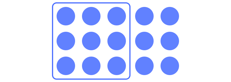
Card UI is a great example of this principle. By creating a visual boundary around a group of content, we are creating a visual relationship between all of those objects. Generally this is done using borders or shadows.

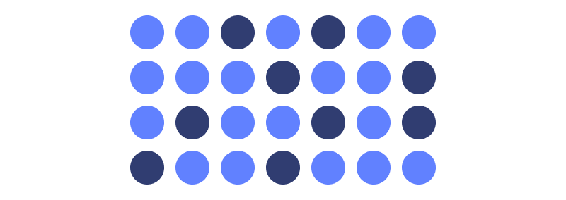
Law of Similarity
Objects that are visually similar in size, shape and / or colour will be visually grouped together, even if those objects are not near each other.
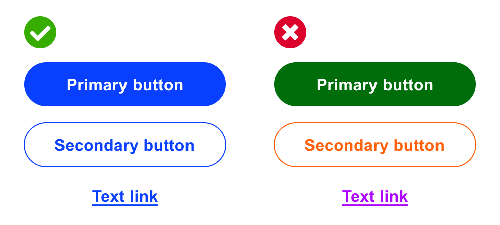
This law is generally applied to objects which can be interacted with. You may notice some sites use the same colour for buttons and text links. This creates a relationship between these objects and teaches the user to associate this colour with interactivity.
Law of Continuity
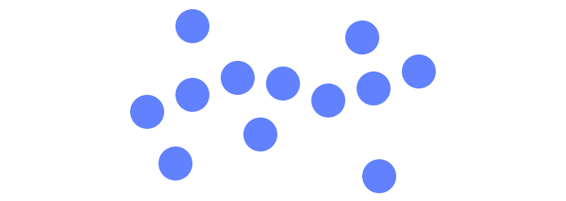
Objects that are ordered in a line or curve appear to be related.
Law of Closure
Objects that are visually incomplete will be perceived as a whole.
